Microcopy refers to the small amount of text on your website, brochure – or even product packaging. It is carefully chosen but designed to have an impact. It’s the little detail that tells you what you need to know about a product or service.
Think about it in the context of walking into a shop on the high street. You usually have a sales assistant to help you with your questions and guide you through the purchase. Your experience is defined by that person.
In a digital world, you don’t have someone who can help you with the details. What you have instead is microcopy, and this is what delivers the user experience (UX). So, what is the purpose and how does it help you?
- Guides your users through the process and tells them what they need to do
- It puts the focus on the benefits and what these mean for your target audience
- Directly addresses any concerns or barriers they might have
- Demonstrates how you do business
- Shows your brand personality
This type of copy is focused on the ‘user’ rather than the ‘customer’, which is a subtle yet important difference. Your target audience is already partway down the purchase route which is why microcopy is more direct. It’s all about making that purchase or taking up your service, rather than just providing useful or interesting information.
Let’s have a look at some examples so you can see this in action.
Heinz tomato ketchup
Here’s a simple one to get you started – a bottle of Heinz tomato ketchup. On the reverse of the bottle is a section about product storage. The microcopy states, “After opening refrigerate and eat within 8 weeks.”
This is great as it confirms that you must put this product in the fridge and eat by a certain time. These are very clear instructions. It also means you will see it regularly which is not always the case when it’s stored in a cupboard. This increases the likelihood of a repeat purchase.
Pretty Little Thing
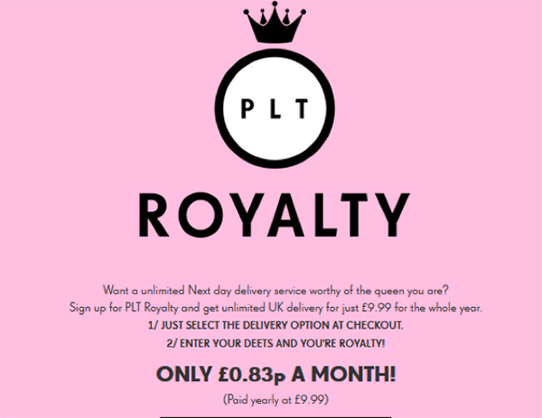
This is a young, vibrant clothing brand. Their website is not understated which is a theme that carries through to the microcopy. Here is their premium delivery service described in the context of their target market.

It lays out all the details you need to know and how to take up the offer. The price has been presented as a monthly amount to make it even more attainable.
They then summarise the key benefits in order of priority, using the language of their users.

This demonstrates a detailed understanding of their target market, their needs and motivations. All focussed on increasing the likelihood of them to taking up the offer.
WordPress
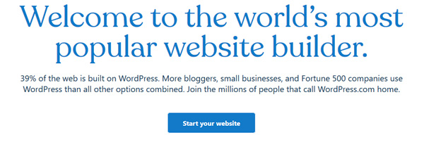
This website has many great examples of how to use microcopy. The opening headline sets the tone for what is to follow.

The intro confirms to the user they are in the right place by simply saying what they do and their pedigree. The microcopy backs this up with the statistics and details of who uses their services.
You are then invited to join a significant number of people. The copy is finished with a feeling of intimacy. By using the word ‘home’ there is a sense of family and inclusion. The call to action is very direct, almost a challenge of ‘what are you waiting for’.
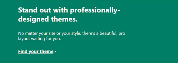
The microcopy continues and starts to address those barriers.

Followed by reassurance and an invite to find what you’re looking for.

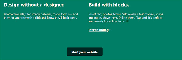
Then more details are revealed. Yes, you will be designing your website – but it’s ok, with us you can do it because we make it easy for you.

AO
Microcopy is often used in something as simple as a search bar for a website, adding clarity to what is on offer. The benefits under the green line also provide a lot more detail and purchase benefits. Hence, a picture is painted on the homepage with very few words.

The help and advice section is as interactive as it can be without talking to someone. It starts with a question you would ask, instructions on what to do in the box and an action you take to get your answer.

There are a couple of things to bear in mind when you are working on your microcopy. It’s important to understand your audience. Who are your product or service users?
You need to look at the experience from their perspective. Think about the sort of questions they will be asking, what the barriers are and the benefits. You need to anticipate the next steps even before they do.
The level of engagement is key because you are not speaking to them in person. Small amounts of text are paramount to help guide users. Explain the key elements of your product or service and how it helps them. Live their journey with them through your marketing materials and make it easy to respond.
.


