Background
Parkmove asked us to migrate their existing website, improve the site’s front-end design and technology, as well as provide ongoing support.
Parkmove were conscious that the front-end (user-facing) side of their platform was incredibly slow at times.
The property search engine on the site was a particular pain point.
It was slow to return results, and user experience was poor. Users were limited in how they could filter their search results and quickly find the property they were looking for.
We put together a proposal to migrate their existing system and to improve both the front-end design and functionality.
Our Approach
With large platforms like this, we like to start by studying the existing database and source code.
Once we had ascertained how the existing platform was put together, we started to make plans to migrate the system over.
Our advice/plan was to break up the platform into two parts.
The first part would be the back-end of the platform where parks could manage their profiles, pages etc.
The strategy for this part of the solution was to continue to utilise the existing system, with the view of making improvements and gains to the legacy code where possible.
However, within the second part of the solution, the front-end and user interface (UI) of the website, would be completely redesigned and redeveloped from the ground up.
In addition to this, any functionality required for the front-end (e.g. search engine, enquiry forms) would be completely rebuilt using modern web technologies.
Before jumping into the design or code, we presented the layout (wireframe) to the team and walked them through the decisions behind the layout and website structure.
This gave the Parkmove team the opportunity to provide feedback, before moving forward with the design and development.
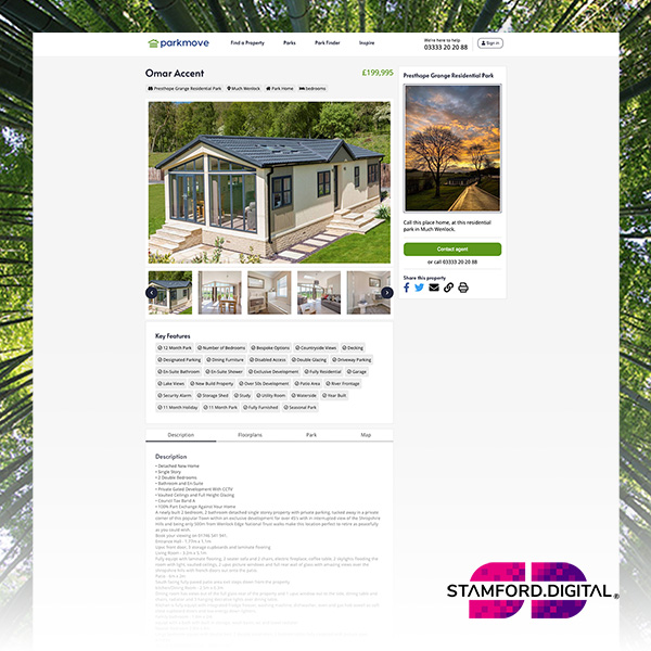
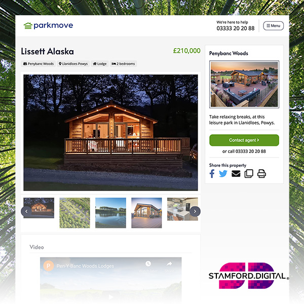
All the photography and content on Parkmove is of very high quality and we wanted to let this content do the talking.
We opted for a crisp, clean and modern website design to position the parks and their properties as the heroes of the site.
Primary CTAs (call-to-action) were given a dark green colour to grab the user’s attention and signpost what we wanted them to do next.
The Results
We delivered a solution that completely transformed the front-end of the website. We added new functionality to improve the user experience (UX), and now the search engine speed issues are a thing of the past.
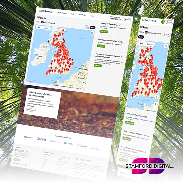
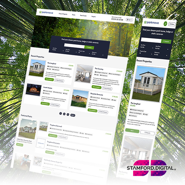
Users were now able to browse and consume information within a clean, modern UI that effectively marketed parks and properties.
The new search returned results quickly and provided better filtering functionality.
Users also now had the ability to find park properties by location, area radius, property type, price and more.
The Park Finder tool was also redesigned to make it easier for users who had a vision and set of requirements for the park where they wanted to buy a property.
The changes delighted the owners of the business. They received a lot of positive feedback about the new look from both parks and the site’s users.
Since the redesign, the business has gone from strength to strength, adding many more parks and properties from all over the UK.
